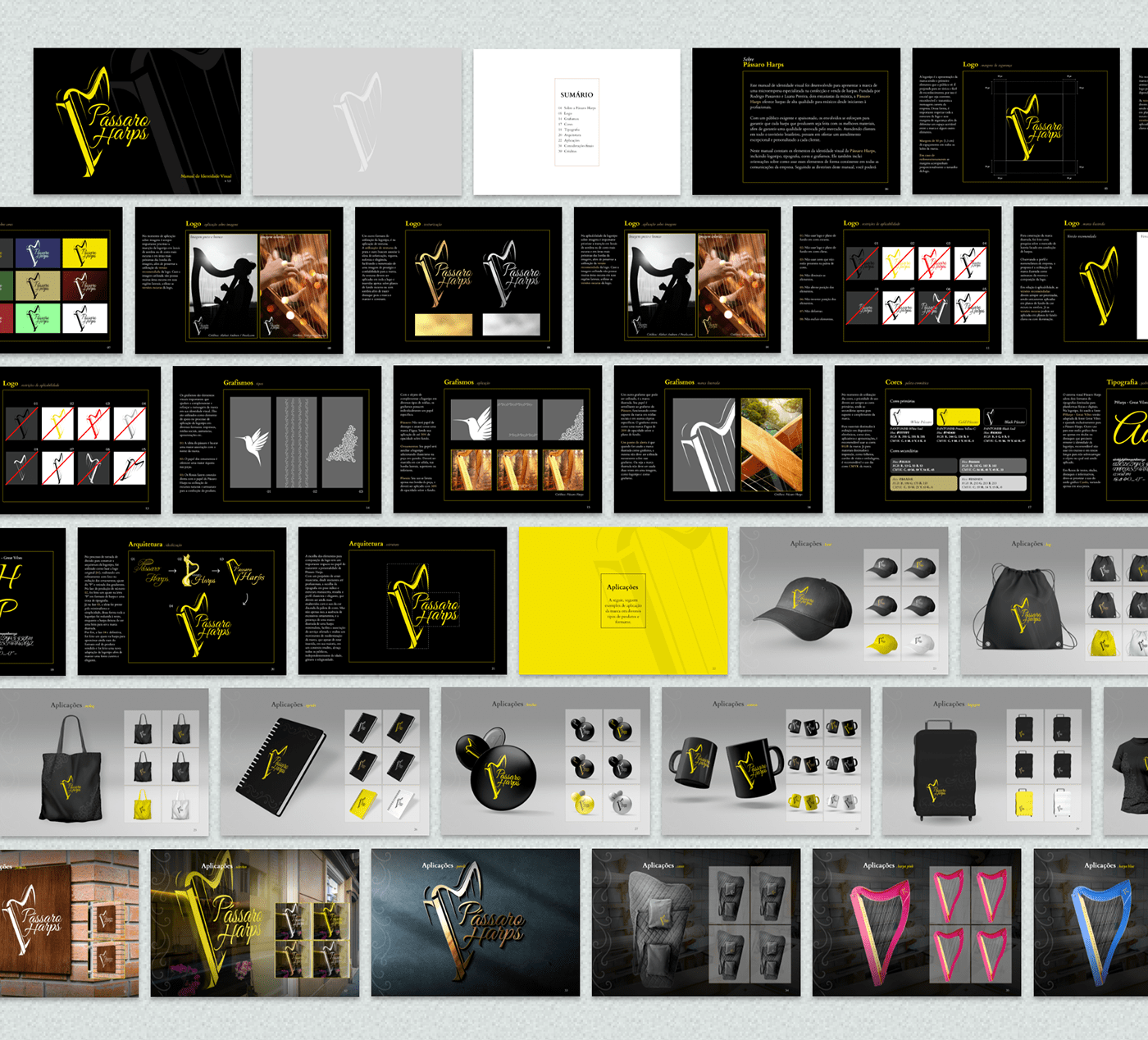
[PT/BR] Pássaro Harps trata-se de uma marca, com um público exigente e já firmada no mercado brasileiro de vendas de harpas célticas. A proposta foi de construção de um branding book, sendo ele desenhado dentro dos parâmetros do cliente, no qual a marca já existente passaria por um processo de refinamento e redesenho, preservando sua essência erudita, natural, elegante, delicada, mas também buscando um traço mais moderno e que trouxesse um sentimento de atemporalidade, focando em envolver todos os públicos independentemente de idade, gênero e etnia.
Além da proposta visual desenvolvida, foi construído e diagramado em paralelo elementos editoriais para dar suporte à marca, sendo esses: papel timbrado, folha de orçamento, certificado de título, envelope para jogo de cordas e manual de instruções.
Além da proposta visual desenvolvida, foi construído e diagramado em paralelo elementos editoriais para dar suporte à marca, sendo esses: papel timbrado, folha de orçamento, certificado de título, envelope para jogo de cordas e manual de instruções.
[EN] Pássaro Harps is a brand with a discerning audience that is already well-established in the Brazilian market for Celtic harp sales. The proposal was to create a branding book designed according to the client's parameters, in which the existing brand would undergo a process of refinement and redesign while preserving its erudite, natural, elegant, delicate essence. Additionally, the goal was to introduce a more modern touch that conveys a sense of timelessness, focusing on engaging all audiences regardless of age, gender, and ethnicity.
In addition to the visual proposal developed, parallel editorial elements were created and laid out to support the brand. These include letterhead, budget sheet, title certificate, string set packaging, and an instruction manual.
In addition to the visual proposal developed, parallel editorial elements were created and laid out to support the brand. These include letterhead, budget sheet, title certificate, string set packaging, and an instruction manual.


[PT/BR] No primeiro momento (1), a letra "P" inicial, que carregava consigo elementos que remetiam a música, foi substituída por um logotipo ilustrado, com design minimalista de uma harpa céltica em uma proposta de apresentar maior associação e harmonizar com o sentimento da tipografia.
Já esta, foi atualizada para uma fonte semelhante (2) em uma proposta de preservar o cerne da marca e causar uma maior aproximação da logotipo antiga com a nova.
Já esta, foi atualizada para uma fonte semelhante (2) em uma proposta de preservar o cerne da marca e causar uma maior aproximação da logotipo antiga com a nova.
Finalmente, foram realizados ajustes na tipografia (3), sendo reduzidos a quantidade e a complexidade de ornamentos dos caracteres, afim de proporcionar maior simplicidade sem perder a elegância.
[EN] At first (1), the initial letter "P," which carried elements related to music, was replaced by an illustrated logo with a minimalist design of a Celtic harp in an effort to establish a stronger association and harmonize with the typography's sentiment.
The typography itself was updated to a similar font (2) with the aim of preserving the core of the brand and creating a closer connection between the old logo and the new one.
Finally, adjustments were made to the typography (3), reducing the quantity and complexity of character ornaments in order to provide greater simplicity without sacrificing elegance.